A nutritional recommendation system to ease the burdens of chronically ill individuals. This mobile app was constructed through extensive user research and iterative design and testing.
Executive Summary
Many Americans, suffer from several chronic illnesses that are recognized as Multiple Chronic Conditions by the Center for Disease Control. These individuals struggle with managing what they are allowed to eat due to nutritional restrictions and effective remedies coming into conflict.
The purpose for this project was to create a desirable user experience for individuals with Multiple Chronic Conditions and test how these users handle our nutrition reference mobile application. We created a user persona to elaborate more on what conditions can do to affect a person's diet. We then built out scenarios and features that could help people with chronic illnesses be more in charge of what they eat rather then having a condition decide for them. Through iterative usability testing we redesigned our mobile application. After advancing from low to mid, then high fidelity prototypes we finalized the first phase of our application: eatable.
Our testing revealed a mobile nutritional reference application with lists of recipes personalized to individual's dietary and medical restrictions. This operation fills a need within the medical and patient community. Next steps to improve the current prototype would include adding nutritional search functionality, inputting rare diseases not available in the system, and improve usability for alternative food searches.
Project Inspiration
Our inspiration for this project was driven by a common thread we noticed within our social circles. Multiple individuals in our personal relationships are suffering from similar medical circumstances that are aggravated by food. Over a series of years these individuals were slowly diagnosed with additional disorders, diseases or conditions. With each additional diagnosis, their ability to manage their resulting symptoms and their personal responsibilities become more complex. Each of these individuals realized that their dietary choices had a profound impact on their ability to keep their symptoms from having an adverse impact on their everyday routine. Simply “eating healthy” and following the USDA's dietary recommendations was not sufficient to alleviating their issues.
The added complication of having multiple medical conditions that were dependent on dietary choices made the ability to eat the right food each day a much more grueling decision than the average person. Regrettably, we repeatedly heard they just simply didn't want to eat anymore because the effort involved in making a stressful decision and the repercussions of making the wrong decision could become overwhelming.
Seeing our loved ones encountering these issues on a daily basis encouraged us to designa way of simplifying the nutritional decision making process. To determine what form our solution to this problem would take, we (1) performed research, (2) conducted user interviews, (2) developed a user persona (3) created a user experience map, (4) defined our scenarios of use and finally performed a (5) competitive analysis.
User Persona
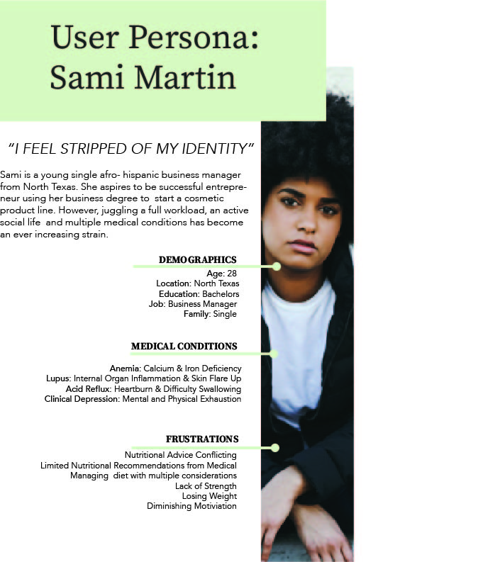
Compiling the commonalities between our target user group and referencing the medical statistics, we developed a user persona who best represented the user of our system information.
Experience Map
We then considered a day in the life of a busy business woman Sami Martin. This day of her life was created to represent a typical day after a recent new diagnosis that made her ability to decide on what foods to eat a stressful situation. The experience map allowed us to not only see how often she encountered pain points, but helped us focus in on which problems we could and couldn't remediate with a digital solution.
Scenarios of Use
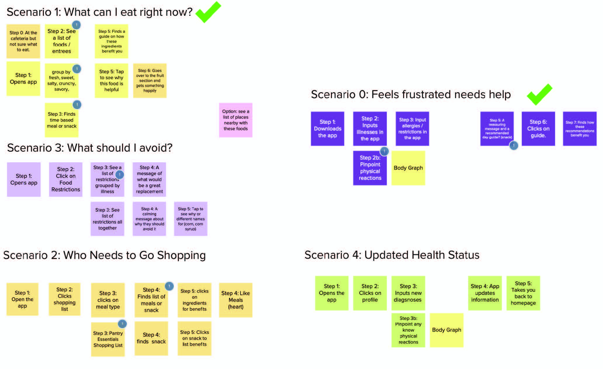
It was tempting to address all of the issues that were mentioned during the user interviews. As a result, we made lists of all the scenarios we could address within the system. However, reasonably only so many of the problems could be addressed in the time allotted to a detailed degree. To better understand the scope of the system, we broke each scenario down into the individual steps it would take to resolve each scenario. Doing so, allowed us to see which scenarios really best addressed Sami's most common issues.
Competitive Analysis
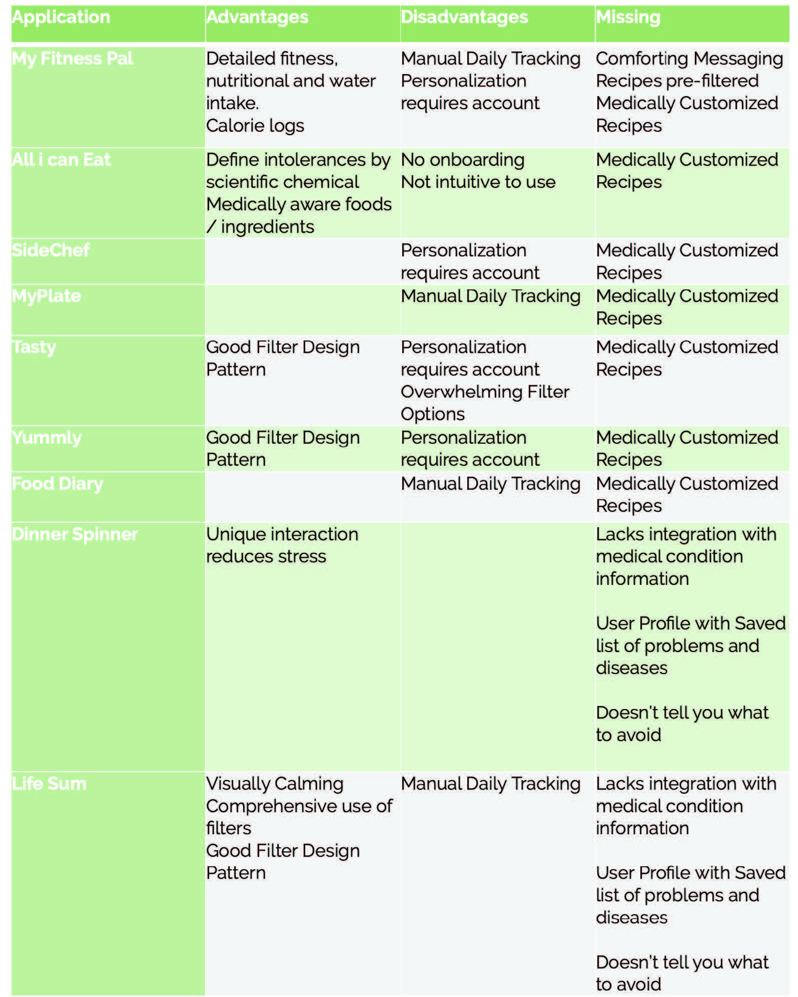
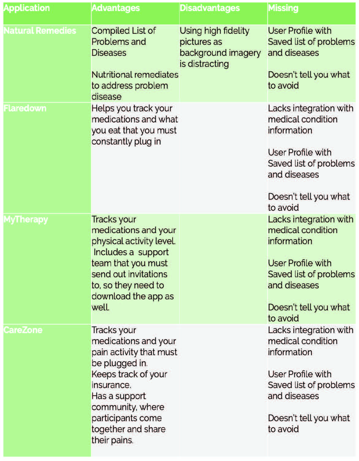
In an effort not to reinvent the wheel, and to explore the possibility of designing brand extensions, we explored over a dozen different applications. Additionally we explored how we could design our app to incorporate encouragement and support.
Iterative Prototyping
The low-fidelity prototype began with rough sketches of what could be included in the app. In order to illustrate all our ideas and features we made two scenario flows. The first user flow was Scenario 0 - App Sign Up which allowed users to download and configure the application. This flow consisted of the user logging in information such as food allergies or recommended foods to avoid as advised by their medical doctors. Based upon this information provided, the app would then compile and customize all food recipe recommendations and restrictions for their unique circumstances
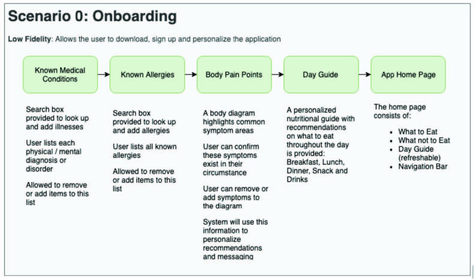
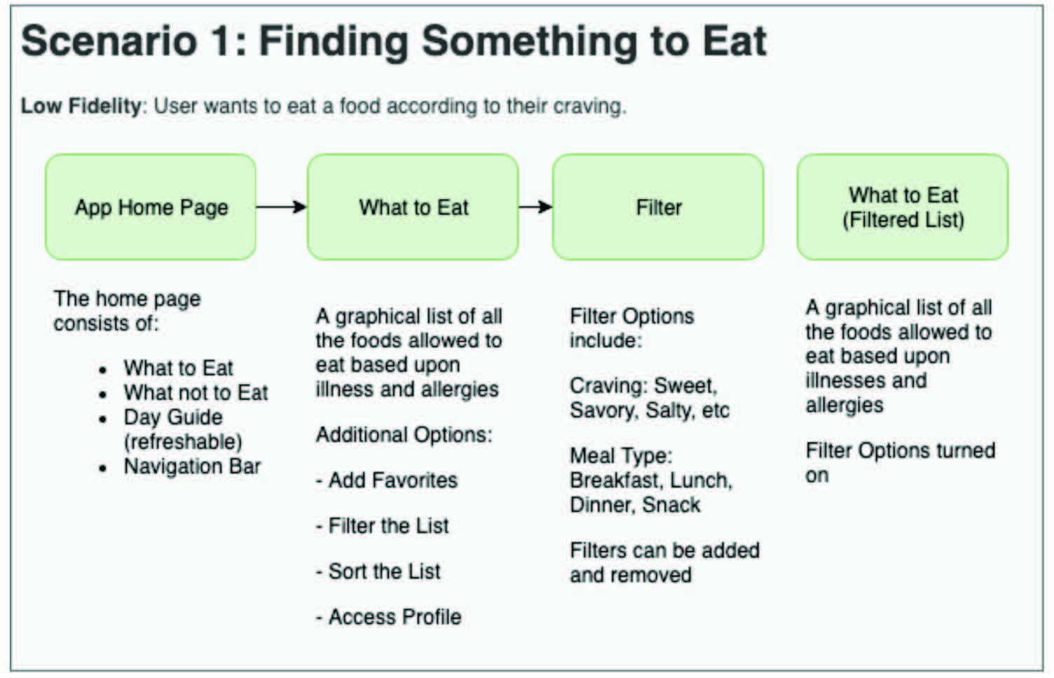
We began our user testing with a low-fidelity paper prototype. During the process we had our users sign a release and consent form to make sure they were well aware of the confidentiality around the app. We tested two users who are very familiar with chronic illnesses and the different food restrictions chronic illnesses can have.
We found that users want clarity when logging in their diet restrictions and chronic illnesses. Our user testing concluded that having a body graph with pain point to describe a user's body pain was too disconnected from the purpose of the application. It caused more confusion than valuable insights. The initial motive was to have our users be able to touch the screen and describe where their physical symptoms affect them the most.
The purpose for that feature was to have users input they suffer such as “redness on the cheeks”, so the app could say “drink green tea for less redness and inflammation in your cheeks”. Since this feature was ancillary to the project objectives, we removed it to ensure a simplified onboarding process.

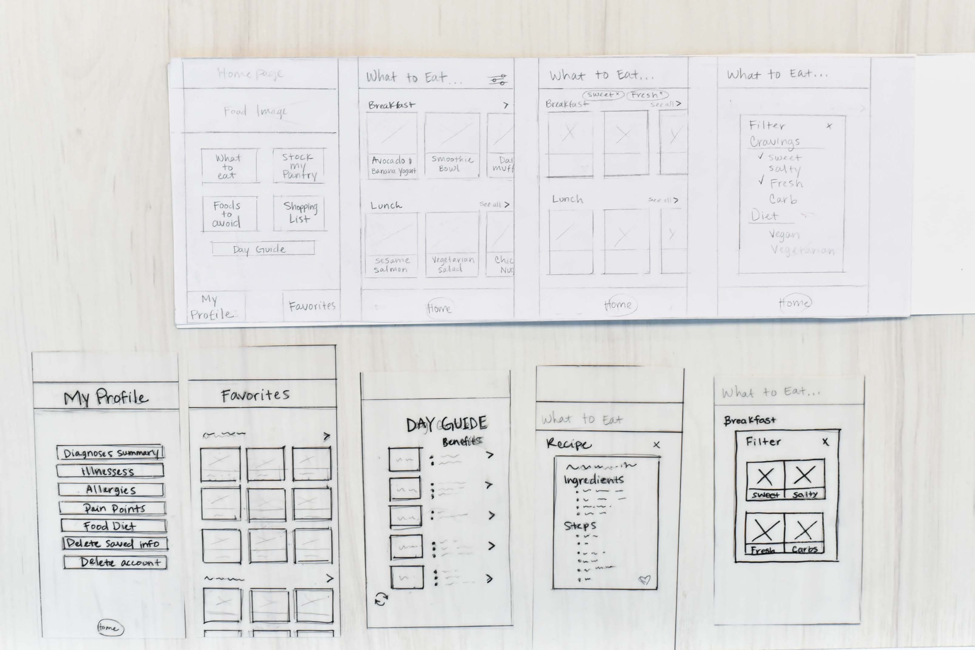
Mid Fidelity and Discovery
Our second prototype iteration focused on the application flow as opposed to visual design. We upgraded from a paper prototype to a digital prototype and improved the onboarding process. We took out the body graph pain points and just kept “Any known current illnesses”, “Any current allergies”, “Day Guide”, and then the “Homepage”.
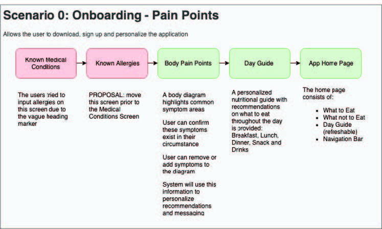
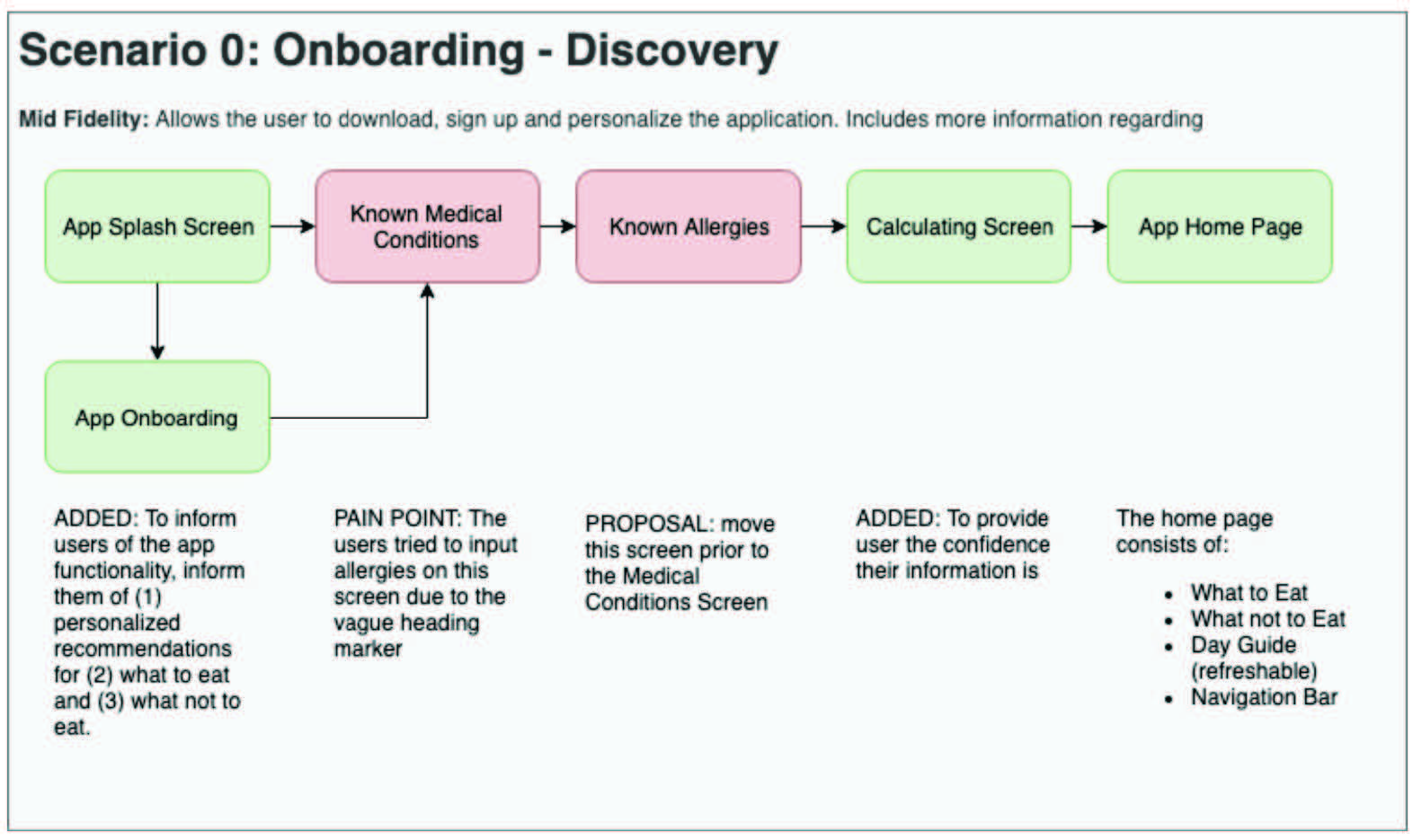
The purpose of this round of testing was to analyze the apps terminology, usability and the application feature set. We tested two people who have a technical background and therefore provided us with different viewpoints. They critiqued our app characteristics and we asked them questions to navigate around the app and how the app made them feel.
With the testing of our two users we discovered that our terminology for “medical condition” was misleading. Our intention was only to capture medical illnesses, diseases and disorders but not allergies. All of the users tried to input allergies on the medical conditions screen. So we decided to prompt the user for allergies first, then ask about the remaining medical conditions.
Our testing task to “Update a health status” was too vague and the user didn't realize we wanted them to update their medical conditions. There was also not a back button for our “settings” screen and our design flow prevented users from updating their profile settings easily. Additionally, our fonts were too small to catch the users eye as a title and users wanted visual reassurance that their health information was secured. Despite the need to improve terminology, testing process, and placements of words, the users were eventually able to complete the steps successfully. They stated the features they would use the most which was finding the foods to eat.
High Fidelity Prototype
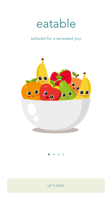
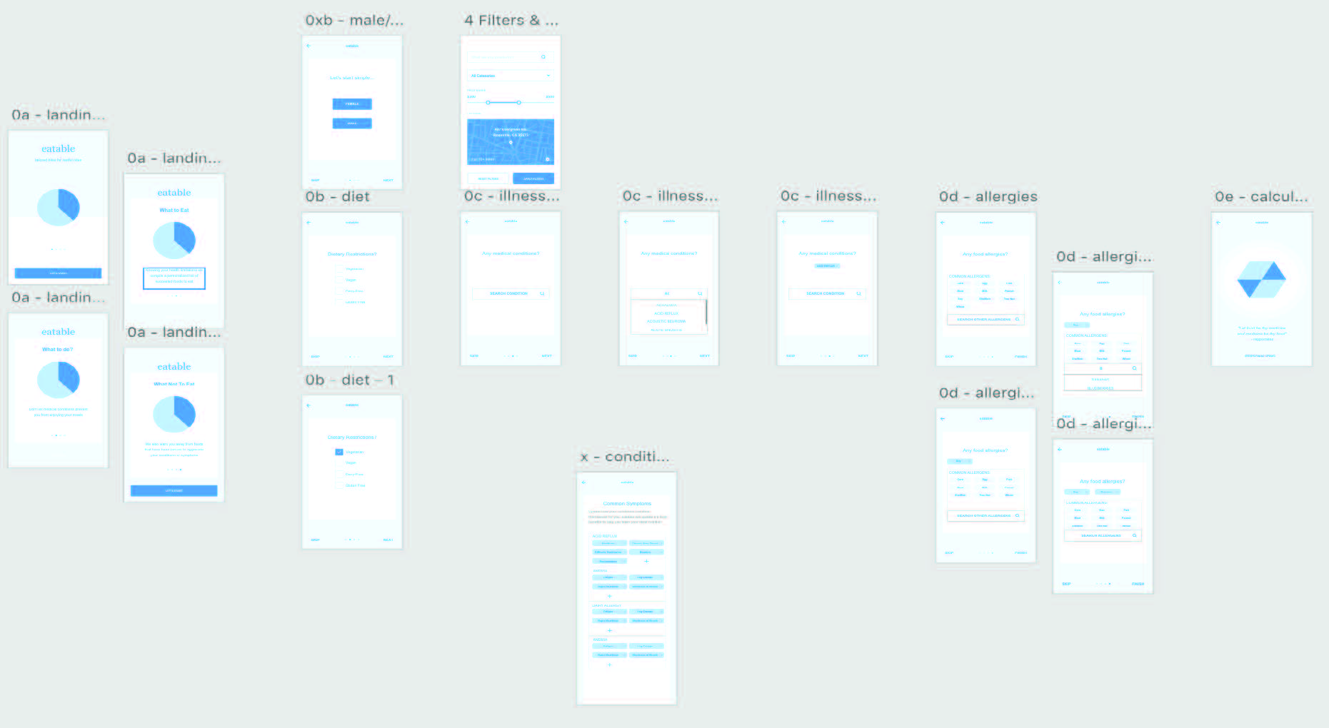
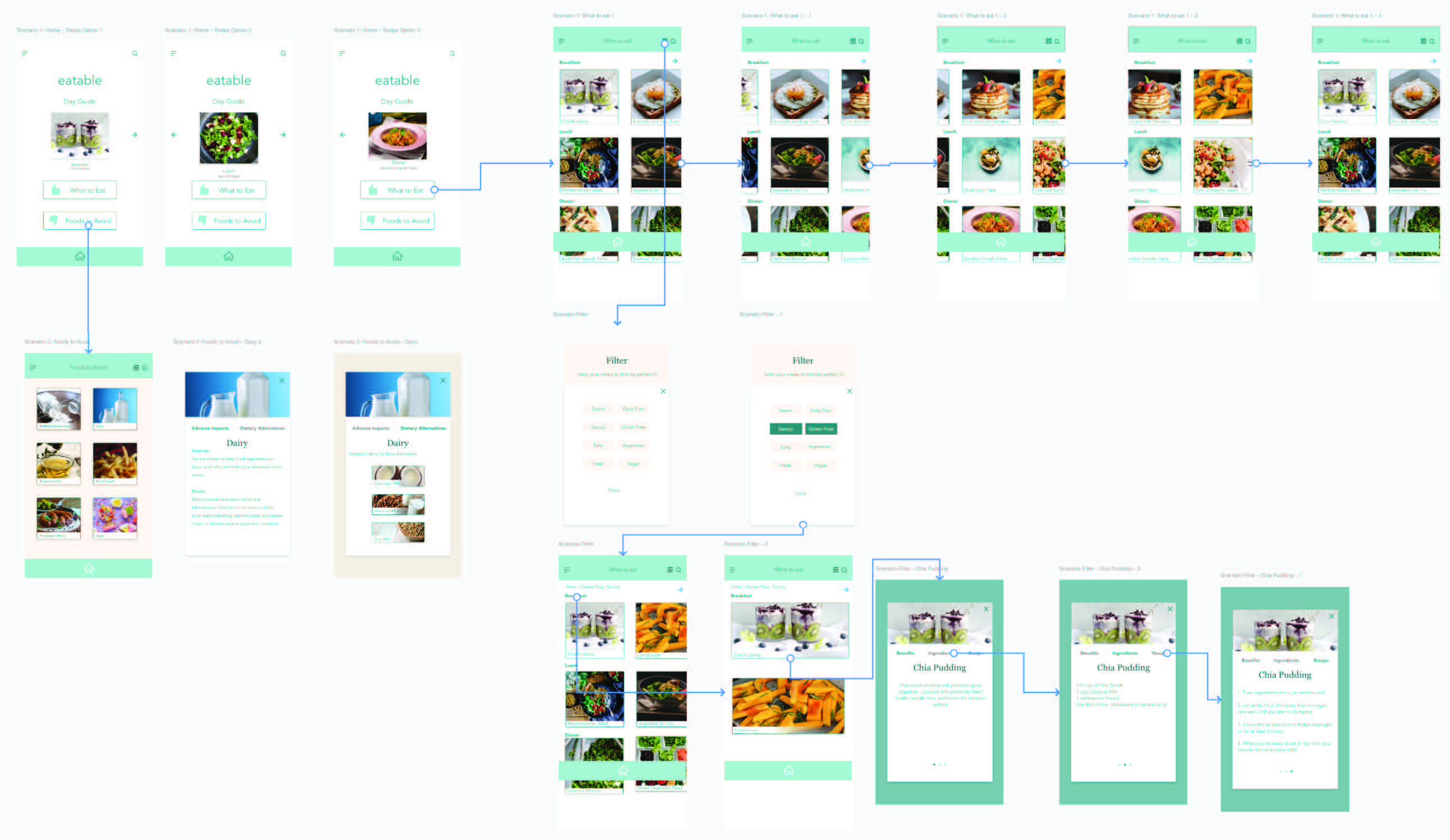
For our High-fidelity app, in addition to addressing our user's pain points from the mid fidelity round, we improved the functionality by employing common iconography. We changed our testing prompting from “health status” to “health restrictions”, and made our fonts bigger for better clarification in our meal headers. We created an animated calculation screen to give our users an idea that the app was actively customizing their meals according to their restrictions. In our high-fidelity version we took out the “favorite” segment because it was distracting from the main concept of our app.
For our design we chose colors that would give our users a feeling of calm and ease. We designed a minimalistic look and feel to keep the flow usable and relaxing.
Final Solution
The final iteration of the eatable app addressed our primary concern of giving individuals with multiple chronic conditions a one stop, low hassle reference guide of foods. With this reference they can eat and are able to maintain optimal nutritional management for their symptoms. Instead of various internet searches, bookmarks, and notes being maintained, the eatable app will keep track of all the changes in their health and modify the list of foods accordingly.
Our final testing showed most of our work involves how to direct the user to the appropriate section of the app. This is because certain sections were not as bold as we hoped and so when users were asked to find substitutions for certain foods, users were confused because they were unaware that was a app feature. Additionally, the most commonly requested feature in relation to the scope of this project was to be able to add illnesses and allergies to the system because its rarity wouldn't be recognized by a system itself.
